Image CDN & Modern Responsive Formats (AVIF vs WebP) in Next.js

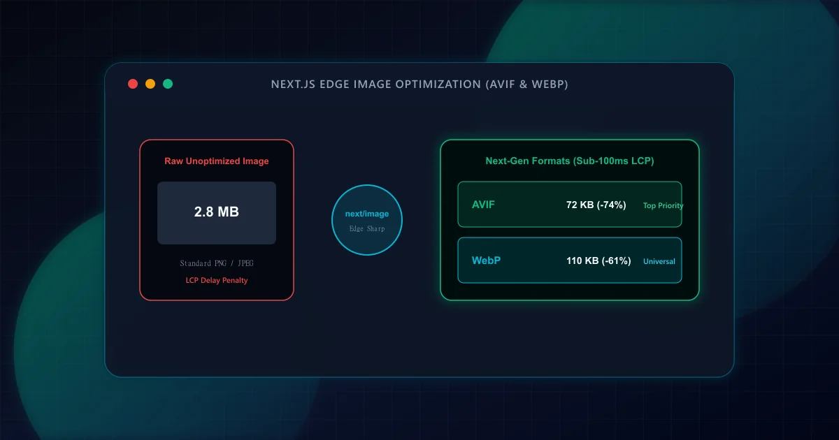
Images account for over 50% of the median web page's total byte payload according to HTTP Archive research. When unoptimized 2MB JPEG or PNG photographs populate the viewport, mobile data connections stall, Time to First Byte (TTFB) benefits are squandered, and Largest Contentful Paint (LCP) delays trigger poor Core Web Vitals ratings. According to web.dev guidance on modern image formats, migrating from legacy formats to WebP and AVIF is the single most impactful byte-reduction optimization available to frontend developers.
Furthermore, Google Search Central Image SEO best practices emphasize that fast-loading, responsive visual assets improve search discoverability in Google Images and boost overall page experience scores. In Next.js App Router, the native next/image component provides an enterprise-grade optimization engine that automates resizing, modern format transcoding, and layout stabilization when properly configured.
Both AVIF and WebP were engineered specifically to replace legacy JPEG and PNG formats. However, their underlying compression algorithms differ substantially in structural efficiency:
- WebP (Google): Derived from the VP8 video codec, WebP provides 25% to 35% smaller file sizes than comparable JPEG images at identical visual quality (SSIM). WebP is universally supported across 97%+ of modern browsers.
- AVIF (Alliance for Open Media): Derived from the AV1 open-source video codec, AVIF leverages advanced intra-frame prediction, chroma subsampling (4:2:0, 4:2:2, 4:4:4), and directional spatial transforms. AVIF delivers an additional 20% to 50% file size reduction beyond WebP, retaining sharp text and detailed textures with minimal compression artifacts.
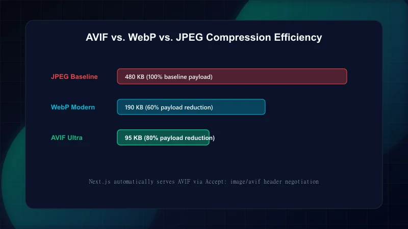
By default, Next.js App Router optimizes images to WebP. To enable AVIF generation, you must explicitly declare AVIF in your next.config.ts configuration. Next.js evaluates formats in array order, serving AVIF to browsers that support it via HTTP Accept: image/avif negotiation, while falling back to WebP for older browsers:
// next.config.ts: Configuring Next-Gen AVIF & WebP Image Optimization
import type { NextConfig } from "next";

const nextConfig: NextConfig = {
  images: {
    // 1. Enable AVIF first, then WebP fallback
    formats: ["image/avif", "image/webp"],

    // 2. Configure responsive device widths matching your CSS breakpoints
    deviceSizes: [640, 750, 828, 1080, 1200, 1920, 2048],
    imageSizes: [16, 32, 48, 64, 96, 128, 256, 384],

    // 3. Minimum cache TTL in seconds (60 seconds * 60 minutes * 24 hours * 30 days)
    minimumCacheTTL: 2592000,
  },
};

export default nextConfig;
With this configuration active, Next.js utilizes native Sharp bindings on the server or edge CDN to dynamically transcode requested images upon initial request, caching the optimized AVIF and WebP variants for subsequent edge delivery. For sub-second LCP architectures, see our guide on Next.js Core Web Vitals optimization.
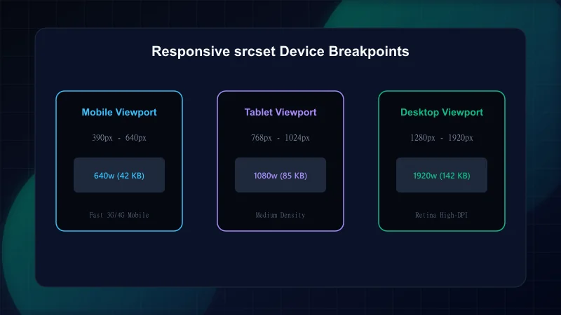
The most widespread mistake in modern frontend development is omitting the sizes attribute on responsive images. When sizes is absent from an image using fill or dynamic widths, the browser must guess how large the image will render on screen before CSS stylesheets have downloaded. By HTML specification default, the browser assumes sizes="100vw" (100% of viewport width).
On a high-density mobile phone (e.g. an iPhone with a 3x DPR), a 100vw assumption forces the browser to request a massive 1200px or 1920px image variant across cellular networks, even if the image only occupies a tiny 100px thumbnail! Defining accurate sizes informs the browser before CSS layout executes:
// Responsive Next.js Hero Image with Viewport-Accurate Sizes
import Image from "next/image";

export function BlogHeroImage({ src, alt }: { src: string; alt: string }) {
  return (
    <div className="relative aspect-[16/9] w-full overflow-hidden rounded-3xl bg-brand-charcoal/5">
      <Image
        src={src}
        alt={alt}
        fill
        // Priority injects <link rel="preload"> in <head> for instant fetch
        priority
        // Accurate media queries inform browser to pick the correct srcset candidate
        sizes="(max-width: 640px) 100vw, (max-width: 1024px) 90vw, 1200px"
        className="object-cover"
      />
    </div>
  );
}
In Core Web Vitals audits, the Resource Load Delay phase accounts for the elapsed time between initial HTML reception and when the browser issues the network request for the largest visible element. When an LCP hero image relies on standard lazy loading, the browser does not initiate the image fetch until layout calculation completes, adding 300ms to 800ms of avoidable delay.
Adding priority (or loading="eager" and fetchpriority="high") instructs Next.js to inject an automated <link rel="preload" as="image" ...> tag into the server-rendered <head>. The browser network scheduler immediately prioritizes the hero image download in parallel with stylesheet parsing, eliminating load delay entirely. To ensure these images do not shift the surrounding text, review our guide on Eliminating Cumulative Layout Shift (CLS) in React.
For teams preparing a production release, cross-reference our Developer's Technical SEO Pre-Launch Checklist to verify image metadata, Open Graph cards, and canonical tags.
- Next.js Documentation: Image Optimization API — Official Vercel guide for next/image and configuration options.
- web.dev: Choose the Right Image Format — Google's technical comparison of AVIF, WebP, JPEG, and PNG.
- web.dev: Serve Images in Modern Formats — Performance impact of next-gen image compression on Core Web Vitals.
- Google Search Central: Image SEO Best Practices — Guidelines for responsive images and search discoverability.
Frequently Asked Questions
Why is AVIF preferred over WebP for modern web applications?
AVIF provides 20% to 50% better compression than WebP at comparable visual fidelity, substantially reducing byte transfer and speeding up Largest Contentful Paint (LCP) on mobile networks.
What happens if a user's browser does not support AVIF?
When configured with formats: ['image/avif', 'image/webp'] in next.config.ts, Next.js checks the browser's HTTP Accept request header. If the browser does not support AVIF, Next.js automatically serves the WebP variant.
Why is the sizes attribute so important on responsive images?
Without an explicit sizes attribute, browsers assume the image occupies 100vw (the full viewport width). On high-density mobile screens, this causes the browser to download an oversized desktop image instead of a lightweight mobile variant.
Should every image on a page have the priority attribute?
No. Only the primary above-the-fold hero image or candidate LCP element should have priority. Marking below-the-fold images with priority congests network bandwidth and delays critical render-blocking CSS and fonts.
Engineering & Technical Audit Team
The ScanWise engineering and technical SEO team researches web performance, Core Web Vitals, crawl mechanics, and digital compliance.
Related Engineering Guides
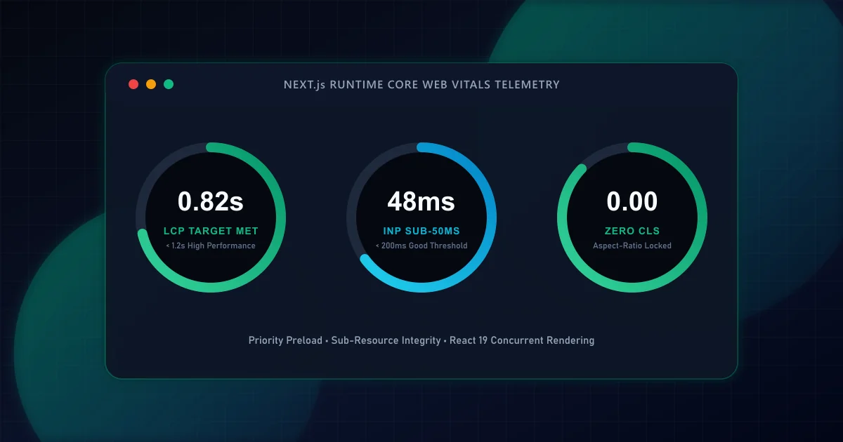
Next.js Core Web Vitals: A Code-Level Guide to Sub-Second LCP
Master the four distinct sub-phases of Largest Contentful Paint in Next.js App Router applications. Learn how priority image loading, font metric fallbacks, and server-streaming eliminate render delays.
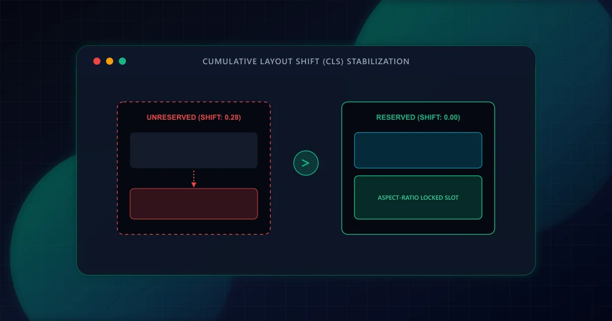
Eliminating Cumulative Layout Shift (CLS) in Dynamic React Frameworks
Prevent disruptive UI jank and improve Core Web Vitals. Discover how to eliminate Cumulative Layout Shift (CLS) in React and Next.js through aspect-ratio reservations, font fallback metrics, and dynamic slot stabilization.
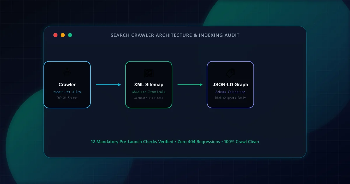
The Technical SEO Pre-Launch Checklist for Modern Web Applications
Prevent catastrophic indexation failures before shipping to production. A 20-point engineering checklist covering robots.txt rules, canonical loops, SSR parity, and sitemap hygiene.