Eliminating Cumulative Layout Shift (CLS) in Dynamic React Frameworks

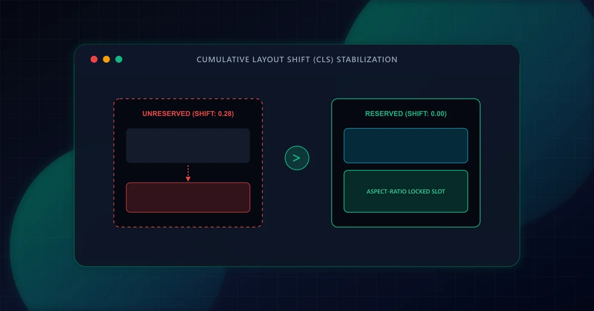
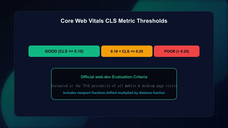
Cumulative Layout Shift (CLS) is one of the three Core Web Vitals metrics utilized by search engines and browsers to quantify real-world user experience. According to the official web.dev Cumulative Layout Shift documentation, CLS measures the sum total of all unexpected layout shifts occurring during the entire lifespan of a web document. A score of 0.10 or below represents a 'Good' user experience, between 0.10 and 0.25 'Needs Improvement', and exceeding 0.25 is classified as 'Poor'. Furthermore, Google Search Central Core Web Vitals guidelines identify visual stability as a verified page experience signal.
In single-page applications and modern hybrid React frameworks like Next.js, unexpected layout shifts frequently occur when components hydrate asynchronously, images resolve without pre-computed aspect ratios, or custom web fonts swap over system typefaces. When text or buttons jump unexpectedly beneath a user's cursor, accidental clicks and severe task abandonment follow. Eliminating these shifts requires systematic architectural constraints enforced from initial server rendering to dynamic client transitions.
To diagnose and eliminate layout instability, engineers must understand the underlying math. The browser layout engine calculates each layout shift by multiplying two geometric components: the impact fraction and the distance fraction.
- Impact Fraction: The percentage of the visible viewport area affected by the shifting elements between two consecutive rendering animation frames. If an unstable element occupies 50% of the screen and drops down by 20%, the combined union of its previous and new positions covers 70% of the viewport, yielding an impact fraction of 0.70.
- Distance Fraction: The maximum horizontal or vertical distance an unstable element moves relative to the greatest viewport dimension (width or height). If an element drops 100 pixels in a 1,000-pixel-high viewport, the distance fraction is 0.10.
The shift score for that single movement is computed as: Layout Shift Score = Impact Fraction × Distance Fraction. In this example, 0.70 × 0.10 = 0.07. Multiple shifts within short window thresholds (session windows of up to 5 seconds with a 1-second gap) aggregate into the final Cumulative Layout Shift metric.
In modern React architectures, unexpected layout shifts rarely stem from complex animations. Instead, they almost universally trace back to three specific implementation gaps:
When an <img>, <video>, or <iframe> is rendered in HTML without intrinsic width and height attributes or CSS dimensions, the browser initially allocates 0 pixels of height. When the binary file downloads over the network and decodes, the browser suddenly expands the element, pushing all subsequent content downward. To see how next/image prevents this automatically, explore our guide on Next.js Image Optimization and modern formats.
Custom web fonts downloaded from remote CDNs do not arrive synchronously with HTML. When using font-display: swap, browsers initially paint text using a local fallback typeface (such as Arial or Times New Roman). When the custom font finishes downloading, the browser replaces the glyphs. Because different fonts possess distinct x-heights, character widths, and line-height ascenders, this glyph swap re-wraps text across lines, triggering severe layout shifts throughout long-form content. For sub-second loading techniques, see our guide on Next.js Core Web Vitals and LCP.
Client-rendered accordions, cookie banners, contextual notifications, and programmatic ad units frequently insert DOM elements above or between existing text after the initial paint. Without pre-reserved container heights, every asynchronous injection forcibly shifts the document tree.
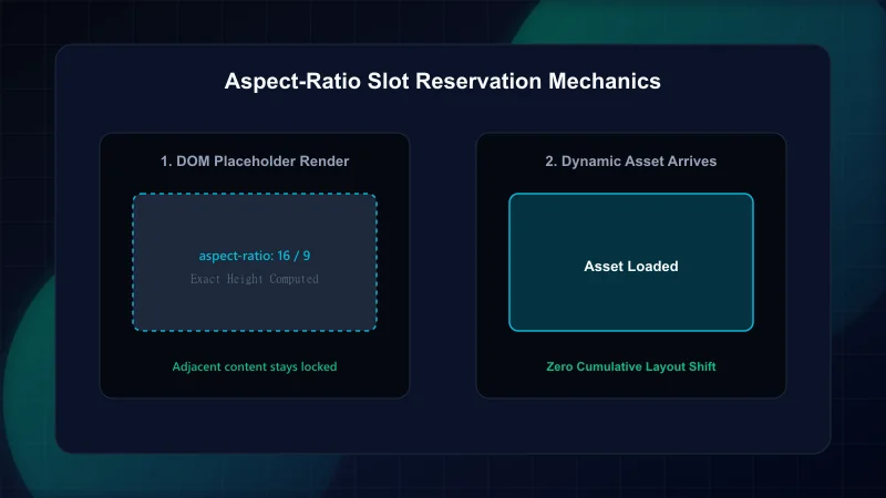
The modern CSS aspect-ratio property allows browsers to compute an element's precise height before its source content has downloaded. According to the MDN Web Docs aspect-ratio specification, setting an aspect ratio informs the browser layout engine to maintain a proportional container regardless of viewport width.
// Reusable React container that eliminates CLS for responsive media
import React from "react";

interface MediaSlotProps {
  aspectRatio: "16/9" | "4/3" | "1/1";
  children: React.ReactNode;
  className?: string;
}

export function MediaSlot({ aspectRatio, children, className = "" }: MediaSlotProps) {
  const ratioStyles: Record<string, string> = {
    "16/9": "aspect-[16/9]",
    "4/3": "aspect-[4/3]",
    "1/1": "aspect-square",
  };

  return (
    <div
      className={`w-full overflow-hidden bg-brand-charcoal/5 rounded-2xl relative ${ratioStyles[aspectRatio]} ${className}`}
      style={{ containIntrinsicSize: "auto 450px" }}
    >
      {children}
    </div>
  );
}
By enforcing aspect-[16/9] on parent containers, the layout engine allocates the exact pixel footprint in the DOM tree during the initial layout pass. When the underlying image or iframe finishes fetching, zero pixel movement occurs.
In Next.js App Router, using next/font/google or next/font/local automatically injects zero-shift CSS fallback declarations. Under the hood, Next.js calculates the exact geometric differences between the requested custom web font and the local system fallback (such as Arial or system-ui), then applies CSS @font-face overrides:
/* Automated metric overrides generated to eliminate font swap shifts */
@font-face {
  font-family: 'Inter Fallback';
  src: local('Arial');
  ascent-override: 90.44%;
  descent-override: 22.56%;
  line-gap-override: 0.00%;
  size-adjust: 107.41%;
}

body {
  font-family: var(--font-inter), 'Inter Fallback', sans-serif;
}
The size-adjust property scales the fallback glyph bounding box, while ascent-override and descent-override ensure the total line-height box matches the custom font down to the sub-pixel level. When the custom font file activates, text glyphs re-render without shifting line wraps or paragraph heights.
For client-only components that load asynchronous data—such as user session banners, interactive notifications, or dynamic ad slots—never render null during the pending state. Rendering null produces a 0-pixel height that snaps open once state resolves, generating immediate CLS.
// Stabilized dynamic client component with pre-reserved slot height
"use client";

import { useState, useEffect } from "react";

export function NotificationBanner() {
  const [data, setData] = useState<{ message: string } | null>(null);
  const [isLoading, setIsLoading] = useState(true);

  useEffect(() => {
    // Simulate async data fetch
    fetch("/api/announcements")
      .then((res) => res.json())
      .then((payload) => {
        setData(payload);
        setIsLoading(false);
      })
      .catch(() => setIsLoading(false));
  }, []);

  return (
    // Pre-reserve min-height to eliminate CLS during pending state
    <aside
      aria-label="System announcements"
      className="min-h-[56px] w-full border-b border-brand-charcoal/10 bg-brand-cloud flex items-center justify-center px-4 transition-all"
    >
      {isLoading ? (
        <div className="h-4 w-64 animate-pulse rounded-full bg-brand-charcoal/10" />
      ) : data ? (
        <p className="text-sm font-medium text-brand-charcoal">{data.message}</p>
      ) : null}
    </aside>
  );
}Detecting layout shifts in development requires real-time diagnostic tooling. In Chromium-based browsers, open DevTools -> More Tools -> Rendering -> check Layout Shift Regions. As you interact with your application, elements that shift will highlight with an ephemeral blue overlay.
In automated testing pipelines, layout stability can be measured directly in Playwright using the PerformanceObserver API. By listening to layout-shift entries that do not have hadRecentInput: true, teams can assert zero unexpected shifts during pull request verification. If you are also auditing event responsiveness, read our comprehensive guide on Interaction to Next Paint (INP) optimization in React.
- web.dev Cumulative Layout Shift (CLS) Specification — Chrome Web Vitals architecture and calculation reference.
- Google Search Central: Core Web Vitals and Page Experience — Google's search documentation on visual stability signals.
- MDN Web Docs: CSS aspect-ratio — Authoritative specification for proportional container sizing.
- W3C Web Incubator Community Group: Layout Instability API — Browser engineering specification for detecting shifted nodes.
Frequently Asked Questions
What is considered a good Cumulative Layout Shift (CLS) score?
According to the Chrome Web Vitals program and Google Search Central, a CLS score of 0.10 or lower is considered 'Good'. Scores between 0.10 and 0.25 'Need Improvement', and scores greater than 0.25 are considered 'Poor'. The score is evaluated at the 75th percentile of all mobile and desktop page visits.
Do user-initiated layout shifts count toward the CLS metric?
No. Layout shifts that occur within 500 milliseconds of user input (such as clicks, taps, or key presses) are flagged by the browser engine with hadRecentInput: true and are excluded from the Cumulative Layout Shift calculation.
How does the CSS aspect-ratio property eliminate layout shift?
The aspect-ratio property allows the browser layout engine to pre-compute and reserve the exact vertical height of an element based on its width before the underlying image, video, or iframe has finished downloading, preventing reflow.
Can web font loading cause Cumulative Layout Shift?
Yes. When custom fonts swap over system fallback fonts (FOUT), differences in character metrics cause text lines to wrap differently, pushing down subsequent page content. Using @next/font or CSS size-adjust and ascent-override descriptors eliminates this shift.
Engineering & Technical Audit Team
The ScanWise engineering and technical SEO team researches web performance, Core Web Vitals, crawl mechanics, and digital compliance.
Related Engineering Guides
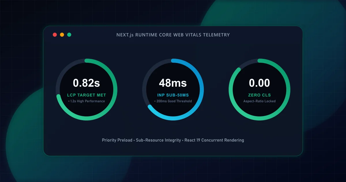
Next.js Core Web Vitals: A Code-Level Guide to Sub-Second LCP
Master the four distinct sub-phases of Largest Contentful Paint in Next.js App Router applications. Learn how priority image loading, font metric fallbacks, and server-streaming eliminate render delays.
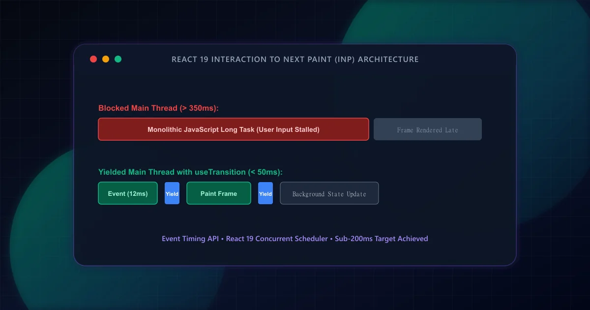
React INP Optimization: Debugging Long Tasks and Event Loop Lag
Interaction to Next Paint replaced FID as an official Core Web Vital. Discover how to identify main-thread long tasks, leverage React 19 transitions, and yield to the browser scheduler.
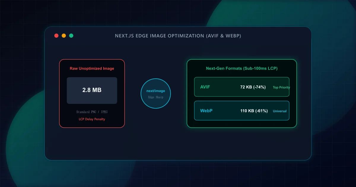
Image CDN & Modern Responsive Formats (AVIF vs WebP) in Next.js
Achieve sub-second LCP by pairing next/image with AVIF, WebP, responsive device sizes, and priority preloading. Eliminate layout shift while slashing image payload by up to 60%.